
What Is International Klein Blue?
Some colours are named. One was claimed. This is the short history of the most famous blue of the twentieth century — and why we gave three quiet vases over to it.
The problem with ultramarine
Painters have prized ultramarine for centuries — ground, in the oldest works, from lapis lazuli carried out of the mountains of Afghanistan, and reserved for the robes of madonnas because it cost more than gold. But raw ultramarine pigment holds a secret: the loose powder is more intense than any painting made with it. The moment pigment meets a conventional binder — oil, varnish — it darkens, glosses over, loses its inner violence. What the painter sees in the jar, the canvas never quite receives.
Yves Klein found this unacceptable.
Klein's answer
In the late 1950s, the French artist — then in his twenties, a judo master convinced that colour could carry pure feeling the way form never could — worked with a Parisian paint supplier to solve it. The result was a matte synthetic binder that holds ultramarine pigment without smothering it: each grain sits exposed, drinking light instead of reflecting it. The colour that emerged is not shiny, not deep in the way of lacquer — it is depthless, a velvet void that seems to sit slightly in front of whatever carries it.
In 1960 Klein registered the formulation as his own: International Klein Blue. He painted canvases in nothing else, coated sponges and casts with it, and made it so completely his signature that the colour itself became the artwork. He died two years later, at thirty-four, having claimed a stretch of the spectrum in a way no artist has managed before or since.
Why it still stops the eye
IKB plays a trick on the eye: because the matte surface returns so little white light, the eye loses the cues it normally uses to read form. Shadows flatten. Edges dissolve. An object painted in it hovers between two and three dimensions — present as a silhouette, absent as a volume. Klein called his blue a window to the immaterial; a physicist would say it is simply what happens when a surface refuses to gloss. Both are true, and neither fully explains the effect of standing in front of it.
Two temperaments, one set
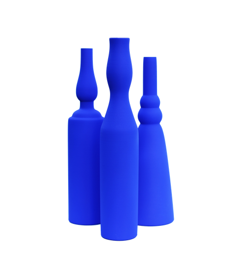
Our International Klein Blue Vase Set stages a meeting that never happened. The three silhouettes belong to Giorgio Morandi — the Bolognese painter who spent a lifetime with the same quiet bottles, letting stillness accumulate around them. The colour belongs entirely to Klein. Forms that want to recede, drenched in a colour that refuses to; each vase is printed, then painted by hand — an in-house process developed to hold the ultramarine matte, flat and even — so it reads almost as a cut-out — until fresh flowers break the plane and pull it back into the room.
It is the loudest thing we make, and it is still very quiet.
The set of three is watertight, 3D-printed to order, and part of our vase collection.


